Eyewear Design Color Guide: How to Choose Frame Colors That Actually Sell
November 21, 2025
1. Introduction — Why Color Matters More Than We Admit
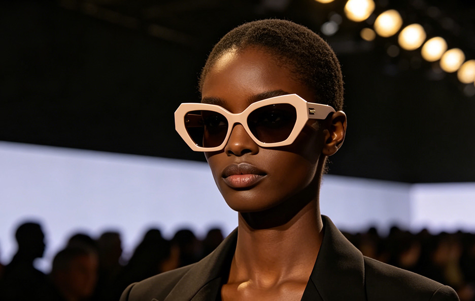
In the eyewear world, shapes usually steal the spotlight. Designers obsess over bridges, hinges, and angles. Product managers worry about fit and SKUs. Founders worry about the cost.
And color?
Too often treated like the final garnish on a dish.
But here’s the truth: color decisions can make or break your collection.
A strong palette can help your brand ride trends at the right time, improve SKU performance, and build a recognizable identity. Meanwhile, poor color choices can quietly sabotage even the best designs.
Many in the industry assume:
-
“Classic colors are safest.”
-
“Trendy colors only suit fashion brands.”
-
“Customers won’t notice small variations.”
Reality check: they absolutely do.
Color matters — commercially, strategically, and emotionally.
Let’s talk about how to get it right.

2. Where to Find Great Color Inspiration
2.1 Start with the Basics: Color Theory (Yes, It Actually Helps)
You don't need to be a painter to understand color, but knowing a few fundamentals makes your design instantly sharper.
-
Hue: The actual color (blue, green, amber).
-
Saturation: How intense it is — soft pastels vs. bold brights.
-
Brightness: Light vs. dark tones.
In eyewear design, these influence mood, brand positioning, and market target.
Warm tones feel friendly. Cool tones feel modern. Transparent colors feel premium. Opaque acetate gives a solid presence.
A little theory goes a long way.

2.2 Follow Market Trends — But With Your Eyes Wide Open
Colors don't appear magically. They ripple through industries.
You can take cues from:
-
Global trend reports: WGSN, Pantone
-
Eyewear trade shows: MIDO, SILMO
-
Fashion houses: Their FW/SS palettes always influence retail demand
But the secret?
Don’t limit yourself to the eyewear industry.
Some of the most successful color ideas come from completely different fields:
-
Apparel color palettes
-
Handbags and accessories
-
Automobiles' seasonal paint trends
-
Interior and architectural color schemes
Cross-industry inspiration helps your frames feel fresh — without being risky.


2.3 Look at Your Market: Different Regions, Different Tastes
Not all markets perceive color the same way.
-
EU consumers love earthy tones, neutrals, and crystal acetates.
-
US consumers appreciate bolder contrast and stronger statements.
-
Asian markets tend to choose subtle tones and classic metal colors.
Age also plays a role:
-
Young buyers are adventurous and love statement colors.
-
Mature consumers lean toward classic, refined, timeless hues.
Understanding preferences makes your palette smarter — not larger.

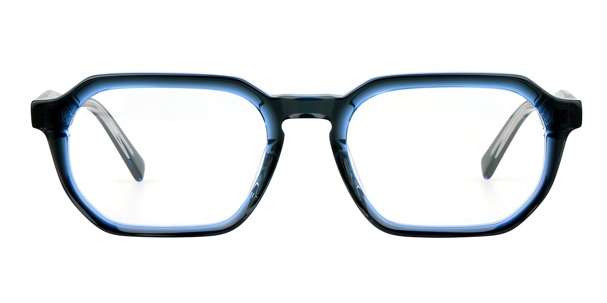
https://www.b-eyewear.com/products/optical/mens_optics/Bold-Acetate-Eyewear-New-design.html
2.4 Mother Nature: The Most Genius Color Designer
Nature delivers color palettes designers could never invent:
-
Tones from leaves, sunsets, ocean gradients
-
The patterns of stone, wood, or animal textures
-
Soft neutral tones are perfect for sustainable or eco-inspired brands
Especially if you're building an "eco-conscious" collection, natural colors feel authentic and instantly relatable.

3. The Business Side — Making Color Commercial (Not Just Pretty)
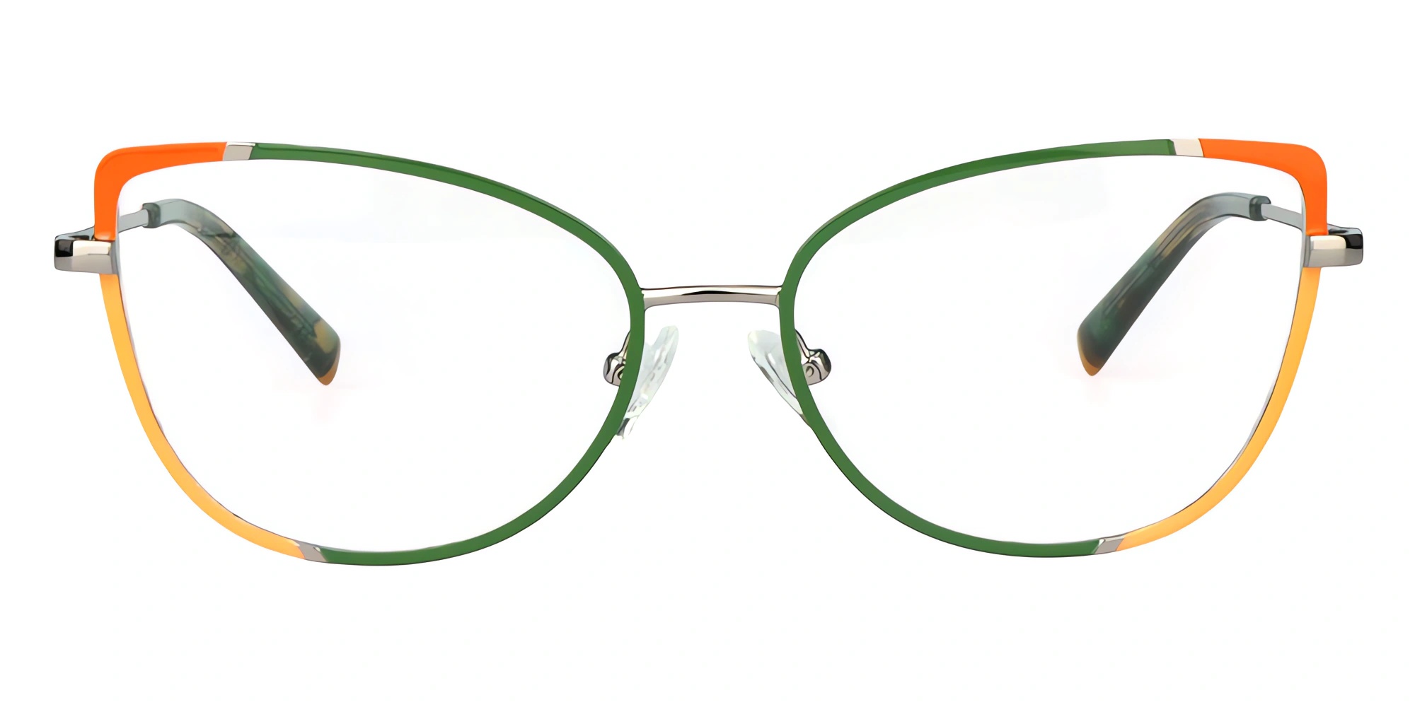
3.1 Using Color to Build Collection Identity
Great collections aren't just grouped by shape — they're unified by color logic.
It could be:
-
A repeated accent color
-
A material-based palette
-
Seasonal tones
-
A signature color across the collection
Color creates personality. Personality creates memory.
3.2 The Power of Signature Colors
Think Tiffany Blue.
Think Hermès Orange.

Eyewear brands can also own a color.
When customers recognize your frames by a tone or finish, you're building real brand equity — without spending extra on marketing.
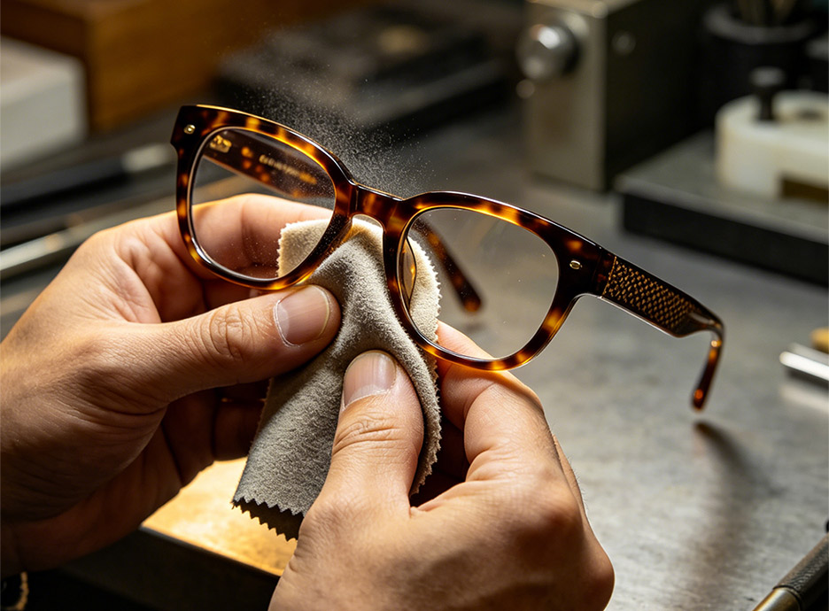
3.3 Keep It Consistent Across Seasons and SKUs
Color consistency is a major challenge in eyewear manufacturing:
-
Different factories
-
Different plating suppliers
-
Acetate batch variations
Yet consistency is crucial for product families.
Spring/Summer palettes usually feel lighter, brighter, more transparent.
Fall/Winter palettes lean warm, deep, and cozy.
But across seasons, the brand DNA should still feel continuous.
4. How to Build a Balanced Color Assortment
4.1 The 40–40–20 Rule
This simple formula can save your entire collection:
-
40% Best-sellers
(Black, tortoise, transparent crystal — the money makers) -
40% Trend-driven colors
(Seasonal tones that keep your brand current) -
20% Experimental shades
(Your chance to surprise the market and gather data)
This reduces risk while leaving room for creativity.
4.2 Avoid Color Cannibalization
Too many similar colors = unnecessary competition between SKUs.
Your palette should be:
-
Distinct
-
Strategically spaced
-
Designed to maximize total sales, not split the same demand
One warm tortoise is enough. Three similar tortoises is waste.
5. How Bright Eyewear Helps Brands Make Better Color Decisions
At Bright Eyewear, we’ve helped brands build collections for over a decade.
Color is one of the most common areas where clients struggle — and where we can offer the most value.
We provide:
-
A curated acetate & metal color library
-
Trend-informed color suggestions
-
Custom color development for unique brand identity
-
Technical guidance on what’s feasible, stable, and cost-effective
-
Golden samples to ensure color consistency in mass production
Great colors aren’t just aesthetic.
They’re strategic.
They improve sell-through.
And we help you choose them with confidence.

6. Conclusion — Shape Attracts Attention. Color Makes the Sale.
Design brings customers to your product,
but color is what convinces them to pick it up.
For brand owners, designers, and product managers, color is more than decoration — it’s a strategic business tool that influences performance, identity, and market success.
Use it wisely, play with it boldly, and let your collection stand out in a crowded market.
👉 Explore our manufacturing services here or contact us for a quote.