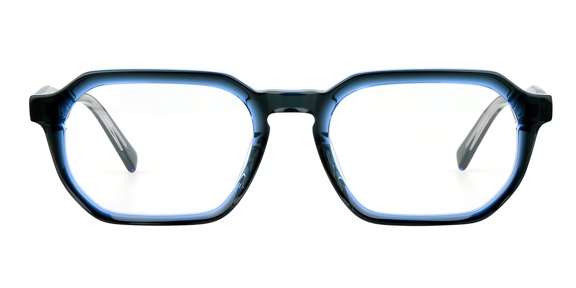
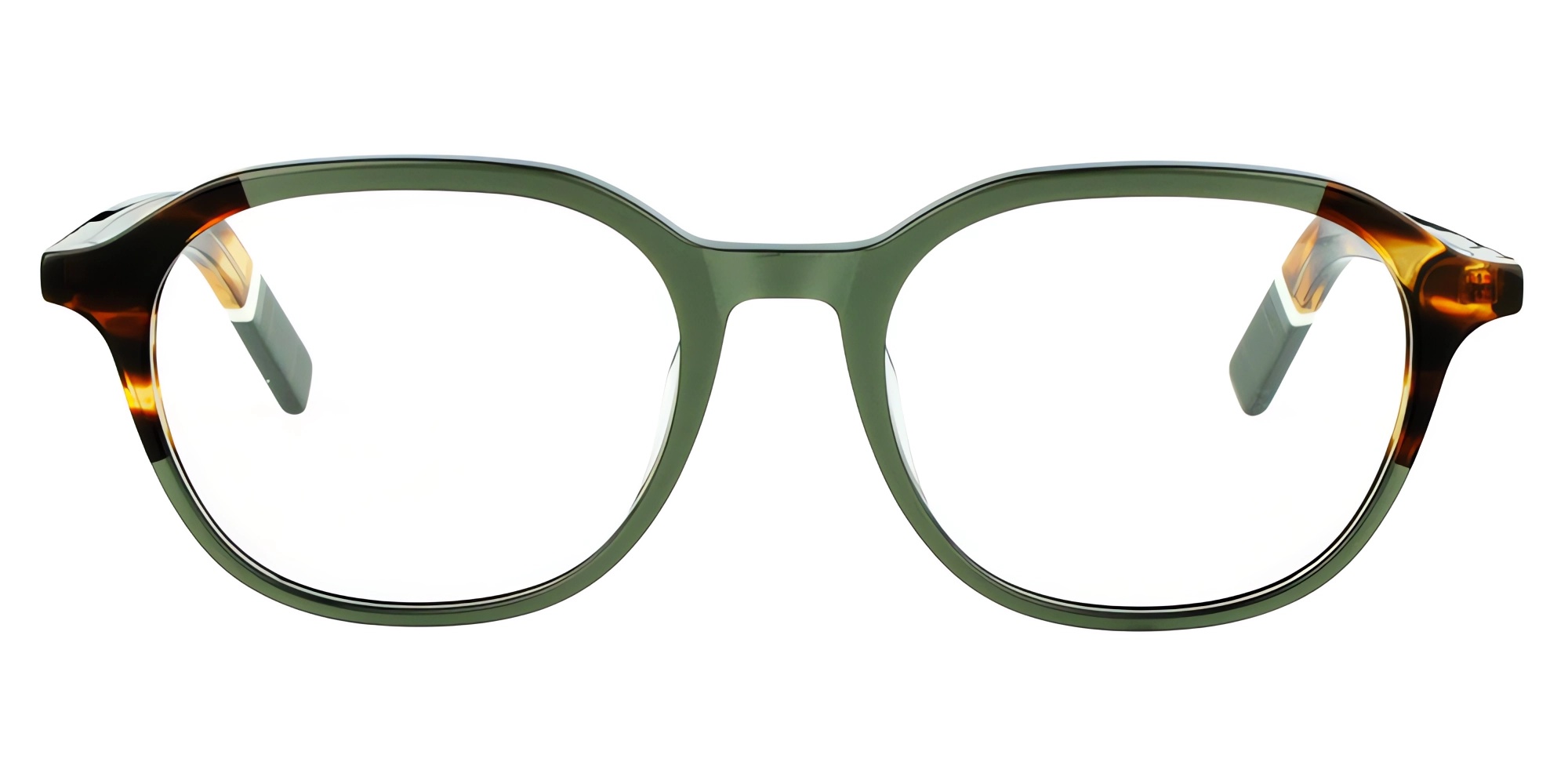
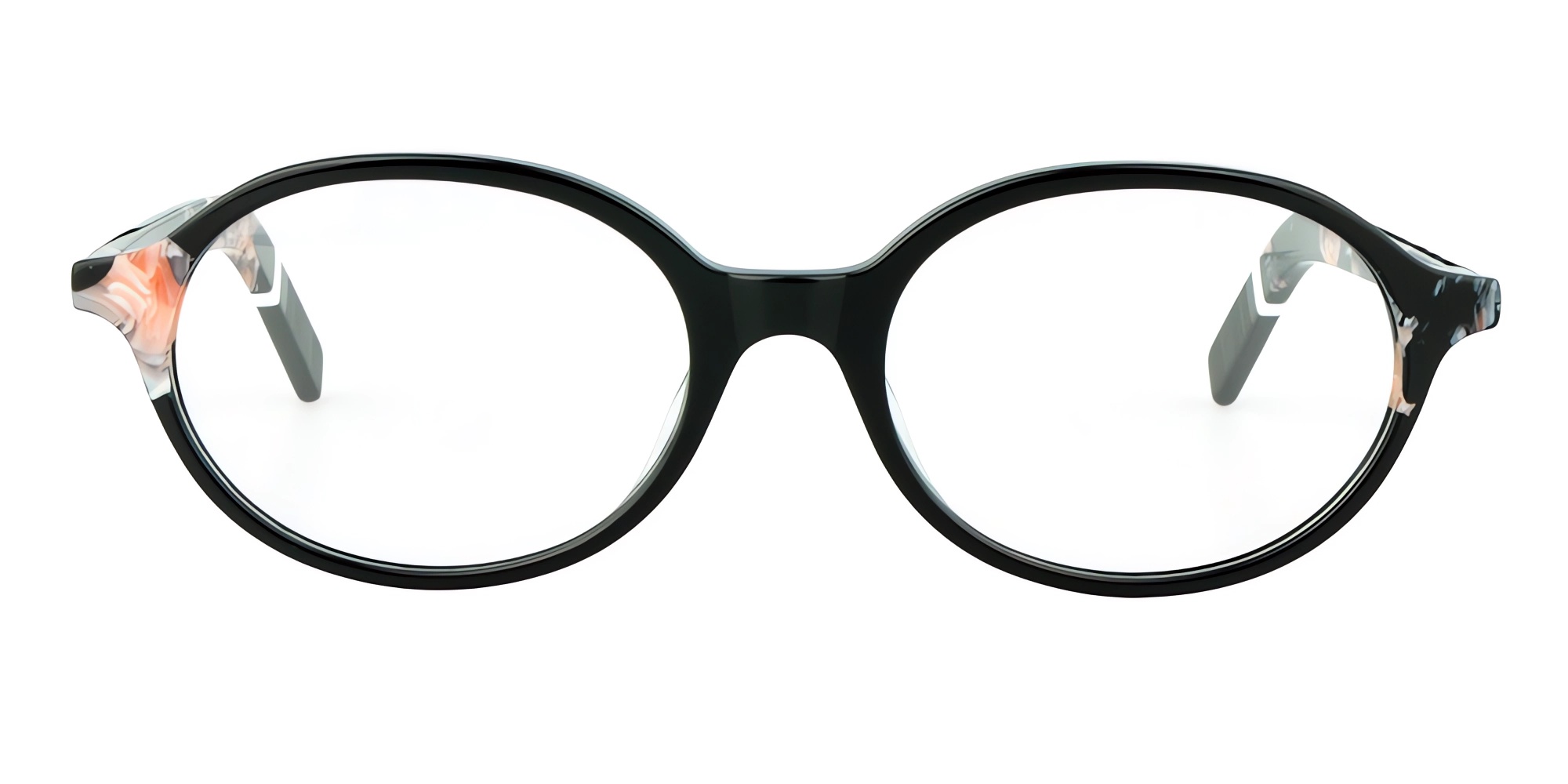
Before Choosing a Frame Color, Ask These 5 Questions
September 20, 2026
Color is the first reason a customer picks up a frame — and the easiest decision a brand makes by feeling. But in eyewear, color is not a taste decision. It is a strategic decision with four layers: the color system that defines it (Pantone), the trend signals that time it (Fashion Week), the psychology that sells it (consumer perception), and the economics that make it viable (commercial planning).
Choose a color right and it carries a collection for years. Choose it wrong and it sits on the clearance wall — because in eyewear, a color mistake is an inventory mistake. Before your next frame color is locked, ask these five questions.
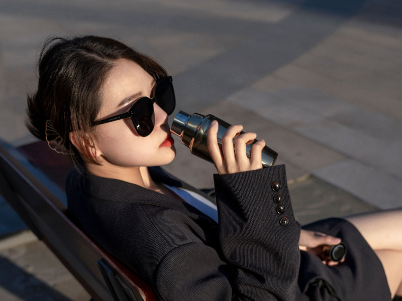
Why Frame Color Is a Strategic Decision, Not a Taste Decision
A frame color does three jobs at once. On the shelf, it creates the first impression that stops a shopper. On the face, it frames the skin, the eyes, and the personality of the wearer. And in the factory, it becomes a material formula that must be reproduced consistently, batch after batch, for the life of the product.
Treating color as personal preference skips all three jobs. Treating it as strategy connects them: a color system for consistency, a trend signal for timing, a psychological insight for appeal, and a commercial plan for inventory. The five questions below walk through exactly that logic.
The Five Questions
Question 1 — What Does This Color Do to the Face?
The most important consumer psychology in eyewear is not about the frame — it is about the face it surrounds. A frame color changes how skin undertones, eye color, and face shape are perceived. The same customer can look warm and healthy in one tortoiseshell and washed out in another.
A few reliable patterns guide the decision:
Cool undertones (pink, blue, grey skin tones) are complemented by cool frame colors: black, silver, gunmetal, blue, purple;
Warm undertones (yellow, gold, olive skin tones) are complemented by warm frame colors: tortoiseshell, gold, brown, burgundy;
Neutral colors — matte black, translucent, brushed silver — work across undertones, which is why they dominate evergreen collections;
High-contrast colors (bold red, electric blue, clear acetate with color accents) work best for statement buyers who use eyewear as an accessory, not a correction tool.
The discipline: before committing to a color, ask who wears it and what it does to their face — not just what it looks like on a rendering.
Question 2 — Is This Color Anchored in a System?
Fashion brands anchor colors to Pantone codes for a reason: a system makes color reproducible. In eyewear, the system question has two parts.
First, the brand system. Does this color belong to a controlled palette — the brand's core neutrals, its signature accent color, and a seasonal color? Brands that lock a color system keep collections coherent on the shelf and recognizable over time. Brands that pick a new color per design end up with a wall of unrelated products.
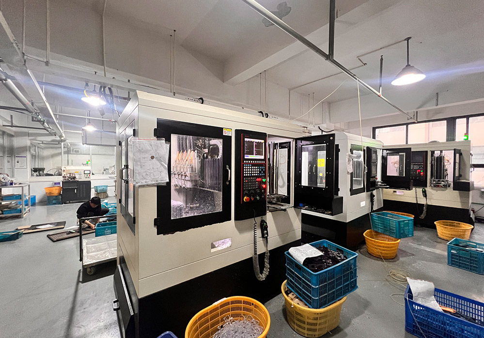
Second, the manufacturing system. A color is only real if it can be reproduced. For acetate, that means a locked material formula — the exact color chips from the acetate mill, the depth of dye penetration, the surface finish. For metal, it means a locked plating or PVD recipe — the bath chemistry, the coating thickness, the gloss level. Pantone codes and physical color chips (not screen colors, which every monitor distorts) are the bridge between the design intent and the factory's repeatable output. If a color cannot be locked in the system, it cannot be locked in the product.
Question 3 — Does It Have a Trend Signal — or Is It a Tail Risk?
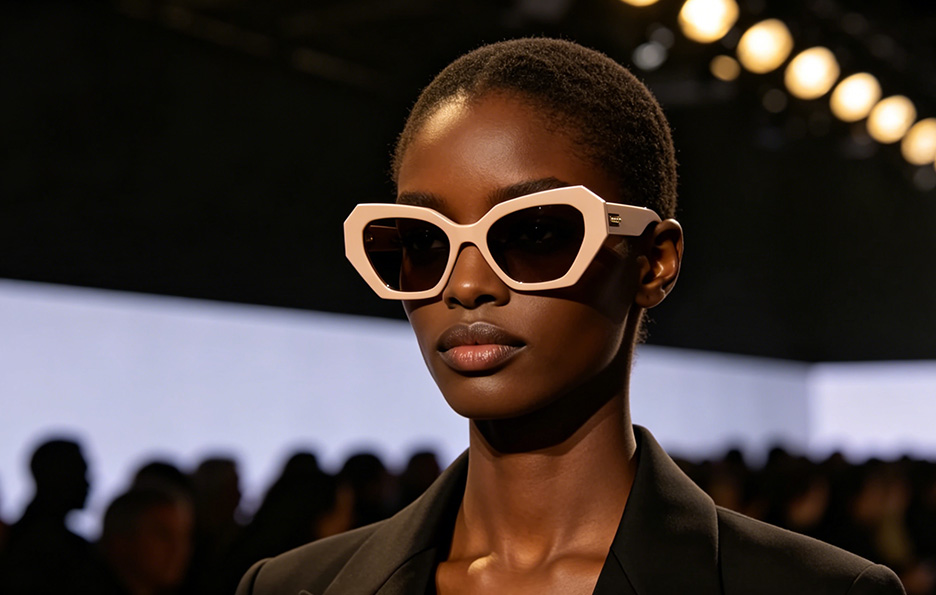
Trend timing in eyewear follows a rhythm set by the fashion calendar. Fashion Week — Milan, Paris, London, New York — is where color directions emerge on the runway, and the signal travels outward through the industry with a predictable lag: apparel moves first, accessories follow, and eyewear typically sits one to two seasons behind the ready-to-wear curve. A color that dominates the runway this season is still ascending for eyewear; a color that has saturated the high street is already in its tail.
Working with the signal, not against it, means:
Ride the signal early. A runway color direction identified at its emergence gives a 12–24 month runway to develop materials, sample, and launch while the color is ascending.
Avoid the tail. When a color has reached saturation in apparel and fast fashion, the eyewear version is late — and the inventory risk is highest.
Distinguish durable directions from flash trends. Colors that return across multiple seasons and multiple fashion capitals are durable directions. One-season runway novelties are experiments — and belong in the small seasonal layer, not the core collection.
The question to ask is not "is this color trendy?" but "where is this color on its cycle?" — and whether your collection is early enough to benefit from the wave.
Question 4 — What Does It Promise the Buyer?
Beyond the face and the calendar, color carries psychological meaning that differs by market and by segment. The same frame in the same color does not speak the same language to a Munich optical buyer, a Milan fashion retailer, and a Miami e-commerce customer.
Common psychological codes in eyewear:
Black: authority, professionalism, understated confidence — the default for business and quiet-luxury lines;
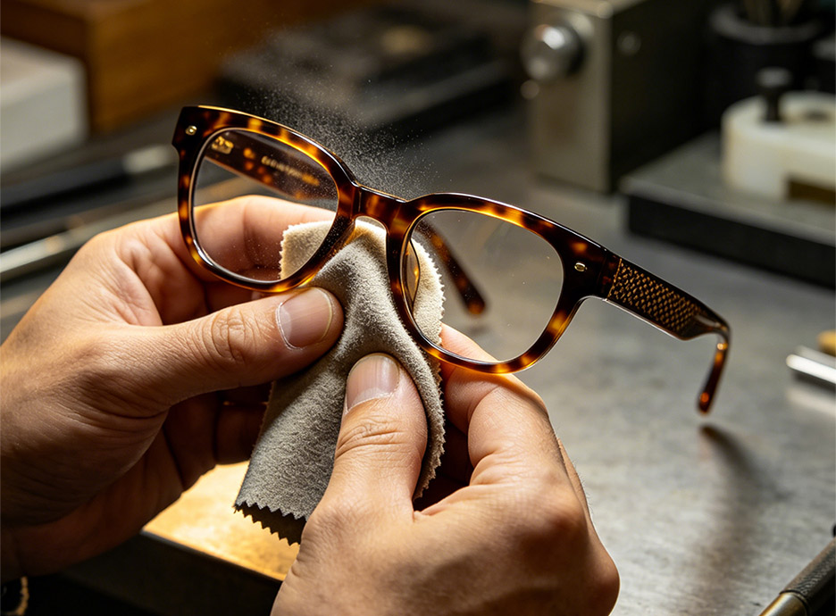
Tortoiseshell: classic, warm, intellectual — reads as heritage and craftsmanship, and carries premium finishes especially well;
Transparent/translucent: modern, light, youthful — signals trend-awareness without loudness;
Silver, grey, gunmetal: technical, precise, premium — the language of metal frames and sports lines;
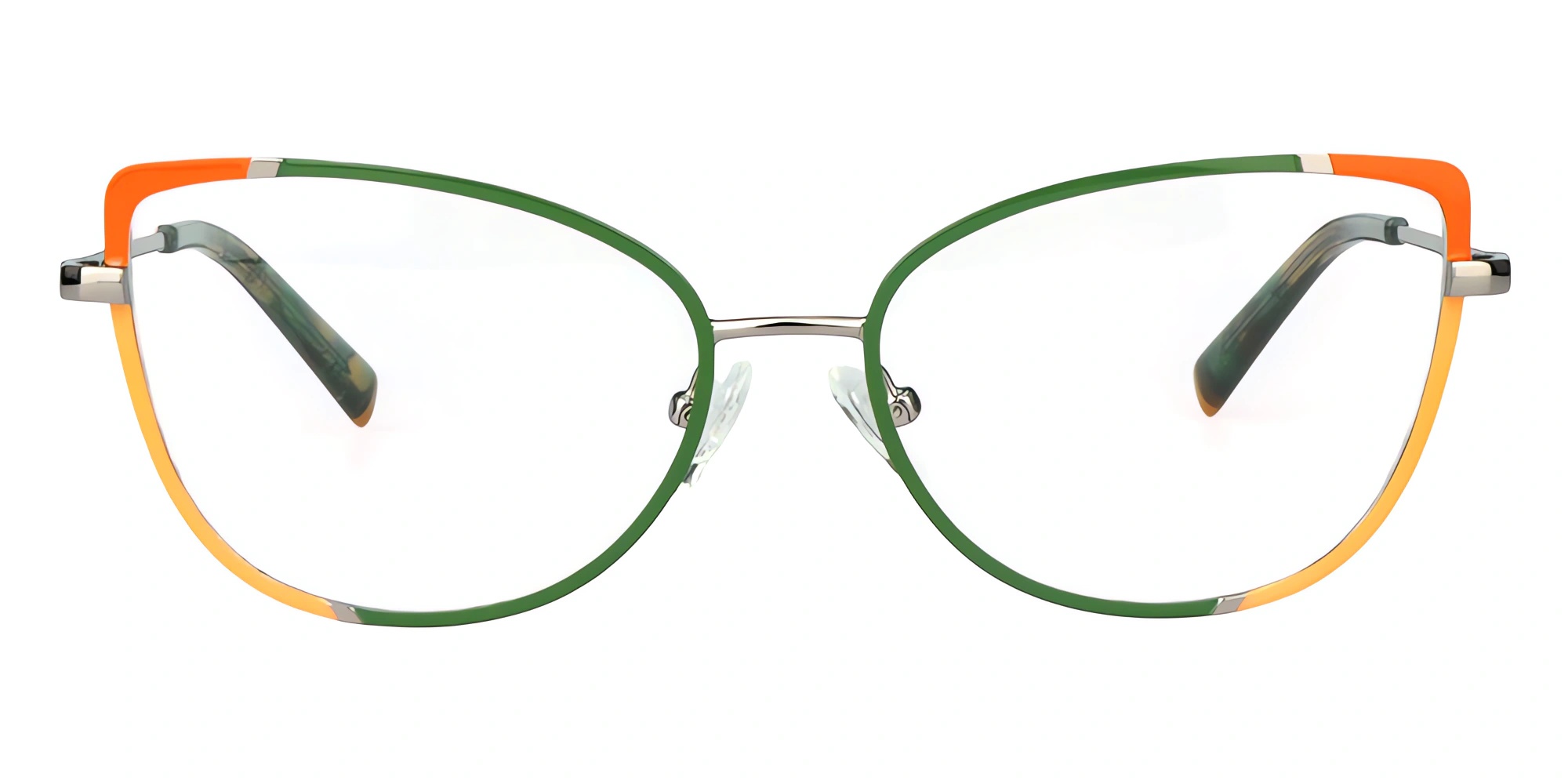
Bold colors (red, blue, green, purple): expressive, confident — a signal of accessory-led buying behavior.
The commercial question underneath: who is the target buyer, and what does this color promise them? A color that promises "quiet luxury" to a European wholesale account will not perform the same in a fast-fashion market — and vice versa. Color choice should be matched to the buyer segment the collection is built to win, not to the designer's personal preference.
Question 5 — Can We Make It Consistently and Profitably?
The final question is the commercial reality check — and the one most often skipped. Every color has a manufacturing and inventory cost structure:
Material feasibility. Some colors are difficult to achieve in acetate (deep translucent reds and greens are notoriously hard to control batch-to-batch); some plating colors are expensive or unstable (certain gunmetal and champagne tones require complex PVD recipes). The factory should confirm feasibility before the design is committed — not after sampling begins.
Minimum quantities and lead times. Special color orders carry MOQ and lead-time implications. A color that breaks the batch size of the core collection disrupts the commercial plan.
Consistency risk. The premium promise of eyewear is "the same frame in the same color" — every time. Color drift between batches is the silent killer of premium brands. This is why locked formulas, physical chips, and batch color checks are non-negotiable in commercial planning.
Inventory allocation. Use a color hierarchy in the plan: core neutrals carry the volume, one or two trend colors carry the excitement, and the brand signature color carries the identity. Allocating the wrong share to a trend color is how collections end up discounting leftovers.
If a color cannot be made consistently at a viable cost and in the planned quantities, it is not a color strategy — it is a gamble.
How the Five Questions Work Together
The five questions are a sequence, not a menu:
Start with psychology (Question 1) — what the color does to the face, and what it promises the buyer (Question 4);
Validate with signals (Question 3) — where the color is on its trend cycle, and whether the timing is early enough;
Lock it in a system (Question 2) — the brand palette, the Pantone anchor, and the reproducible material formula;
Confirm the economics (Question 5) — feasibility, MOQ, consistency, and inventory share.
A color that passes all five is a strategic asset: it sells, it can be reproduced, it is timed correctly, and it fits the plan. A color that fails any one of them becomes a risk sitting on the shelf.
Conclusion: Color Is a Decision, Not a Feeling
The best frame colors are not the ones the designer loves most. They are the ones that survive the five questions: they flatter the face, anchor to a system, ride a real trend signal at the right moment, promise the right thing to the right buyer, and can be made consistently at a viable cost. Pantone gives the language, Fashion Week gives the timing, consumer psychology gives the appeal, and commercial planning gives the discipline.
As a professional eyewear factory with over 18 years of manufacturing experience, we help brands answer these questions with data, not guesses: locked acetate color formulas and metal plating recipes, physical color chips, feasibility checks before sampling, and batch-to-batch color control across the whole process. A color strategy that is designed, timed, and manufactured correctly is one of the most reliable margin builders in eyewear. We would rather help you build it before the mold is cut.